Mood is what brings photography alive. We all use it -- every time you take a snapshot and yell “smile!” you are creating mood.
In professional photography, mood can be almost as important as the subject matter. The rendering of the subject “tells” you but the mood makes you “feel.” Feeling is what creates a brand and ultimately what moves someone toward purchasing your product or service.
Professional photographers must answer a fundamental question: what does my client want this photo to say, and how should the viewer feel after seeing it? For example, a photo can make us excited, sentimental, impressed, motivated, or a host of other emotions that can move them toward your brand and making a purchase.

Let’s look at how certain elements in photography create mood and impact our feelings.
Color and Warmth
Warm-toned images create a relaxed, inviting feeling. An image like the one shown below evokes positive feeling such as - I’d like to be there, or, that looks like fun. Warm tones set a great mood for businesses such as travel or romance.

A blue-toned image creates a colder, less-inviting impression. It can be used to add an element of foreboding, grittiness, or mystery. This type of tonality tends to make something feel ominous, or in other cases creates a harsher, more edgy look.

Soft vs Bright
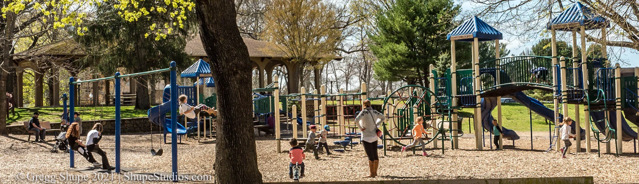
We have been trained to associate soft lighting with something that is relaxing, soothing or perhaps somber. Conversely, light and bright evokes energy and positive feelings. The two images below offer a striking contrast - both are floral but you can see that soft brings your blood pressure down and says - relax, whereas sunny and bright lifts you up, and radiates energy.


Composition
Composition impacts mood through its effect on your eye. Leading lines bring you to a key visual point so your brain and eye don’t have to work as hard. In essence, the image tells you what it wants you to see. It is clean, ordered and visually relaxing. The first shot is an example of excellent architectural photography.

With an un-composed or cluttered image your eyes don’t know where to go. It’s not clear what the image is trying to tell you and this subliminal frustration creates a negative feeling. You tend to move away from this type of image. That is why cluttered, busy advertising tends to be less effective.

Symbolism and Texture
The combination of symbols, texture and lighting make a huge difference in mood. Warm wood vs. cold steel, dark night or blue sky. Take a look at the two photos below - where are you going for a hi-tech seminar and where would you want to kick back and enjoy the company of friends?


Architecture
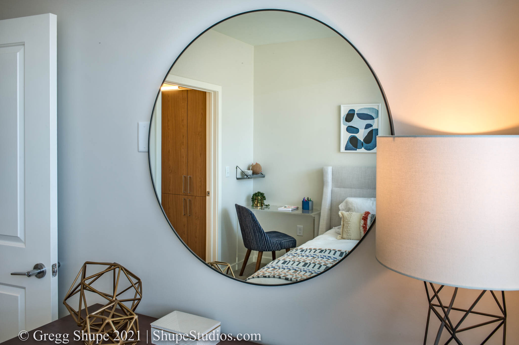
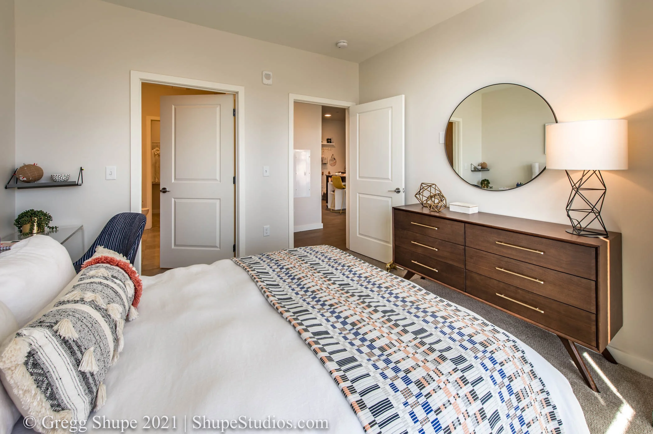
In architecture a normal lens in a tight area can imply a safe, intimate space whereas a wide angle view sets the mood of a large open space and all the feelings that go with it. As you can see below the same space shot with a different lens will have a very different feel.
As a client it, is easy to overlook mood and focus on the subject matter. However, when selling your products and services think of mood as the secret sauce for advertising success.
Work with a photographer to set the visual mood that best fits your brand, bolsters your message and exemplifies your product, project, location or service. Mood is an important piece of equipment in your advertising toolkit, be sure to use it to its fullest.
If you have an important shoot on the horizon I offer two important services at no charge to you:
- A free brainstorming session to identify the right mood to tell your story.
- A free pre-shoot walk-through to stage shots, forestall issues, and identify opportunities to get the perfect shot that says it all.
At Shupe Studios our goal is to wow your audience. If you’re in the Boston area or greater New England, I hope you’ll reach out to me.
We provide one stop shopping for great photography.